I play, coach, and referee local soccer. Mostly with the Peterborough Youth Soccer Club.
I’ve also written about Canadian soccer for a couple of blog sites. Most of my articles present data analysis, because graphs are pretty.
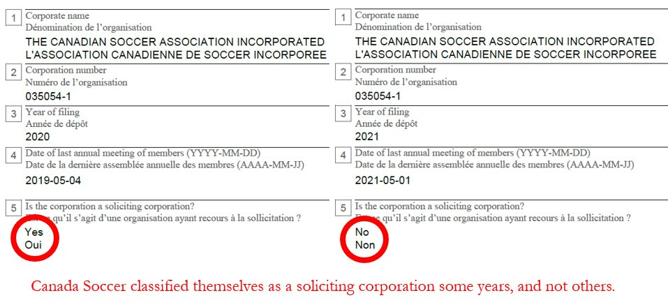
One of my articles gained traction, noting financial reporting irregularities by Canada Soccer. This led to a brief submitted to the Standing Committee on Canadian Heritage for their work on Safe Sport in Canada, and was cited in committee proceedings.
Soccer analytics and writing
My articles on the Canadian Premier League-U Sports Draft
- CPL-U SPORTS DRAFT PART 1: INTRO TO AN ANALYSIS SERIES (May 5, 2021)
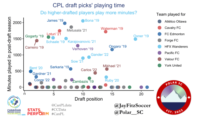
- CPL-U SPORTS DRAFT PART 2: DOES DRAFT POSITION MATTER? (May 14, 2021)
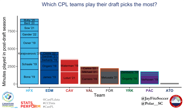
- CPL-U SPORTS DRAFT PART 3: WHICH CLUBS SUCCEED AT THE DRAFT (AND WHICH ONE FAILS)? (May 20, 2021)
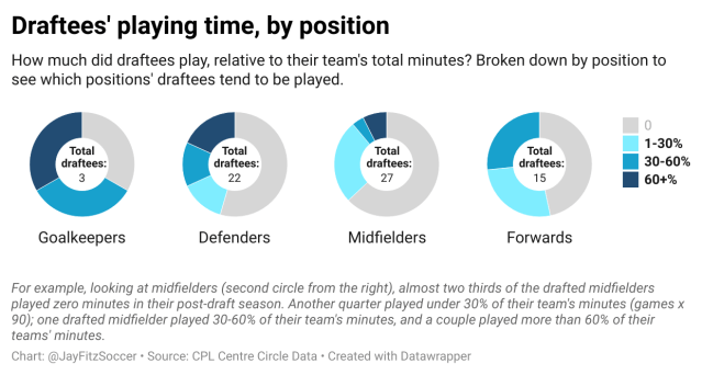
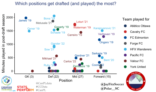
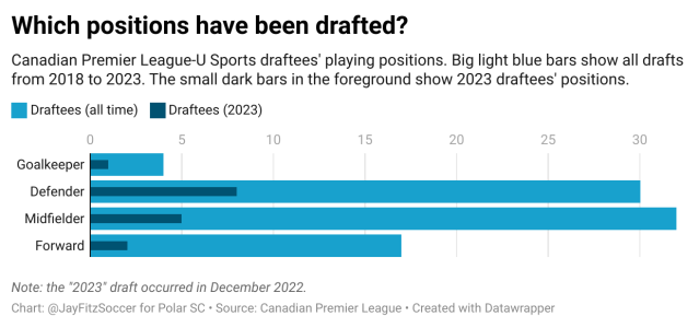
- CPL-U SPORTS DRAFT PART 4: WHICH PLAYER POSITIONS GET DRAFTED (AND WHICH ONES SUCCEED)? (May 23, 2021)
- CPL–U SPORTS DRAFT PART 5: HOW CAN THE DRAFT BE IMPROVED? (May 29, 2021)
- CPL-U SPORTS DRAFT: POST-2021 SEASON UPDATE (Jan. 8, 2022)
- THE 2022 CPL-U SPORTS DRAFT: BY THE NUMBERS (Jan. 21, 2022)
- The CPL USports Draft – Which Draft Picks Tend to Succeed? (Dec. 2022)
Other Canadian Premier League articles by me
- HOW MUCH DO CPL ROSTERS CHANGE FROM ONE YEAR TO THE NEXT? (Aug. 18, 2021)
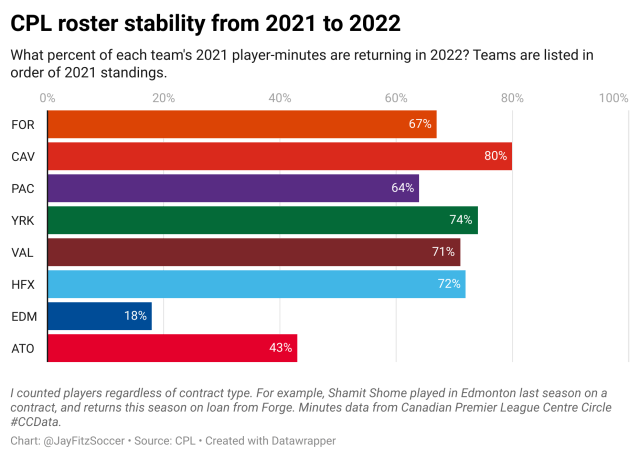
- HOW MUCH DID CPL ROSTERS CHANGE FROM 2021 TO 2022? GENERAL STABILITY, PLUS EDMONTON (Apr. 24, 2022)
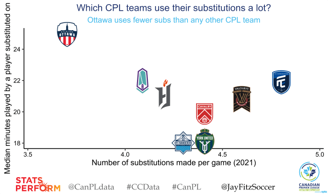
- ATLETICO OTTAWA SUBSTITUTION RATES: DOES MISTA TRUST HIS BENCH? (Sept. 5, 2021)
Other articles and compilations
- How can I watch my favourite soccer league from Canada? A visual guide to which services broadcast/stream the most popular men’s and women’s soccer leagues.
- Canadian soccer podcasts – all of them. A spreadsheet of Canadian soccer podcasts, allowing users to filter and find podcasts to try.
- Did Canada Soccer violate federal corporate legislation? (March 2023)
- This led to a brief submitted to the parliamentary committee interviewing Canada Soccer. My analysis was cited by MPs during questioning.